gganimate examples and echarts4r code that replicates them
echarts4r is a better option for animation.
Examples using echarts4r follow those using `gganimate
Using echarts4r
Using echarts4r
group_bythe variable you want to transition alongSet
timeline = TRUEfor an animationModify an animation with
e_animation.See the article on the timeline component
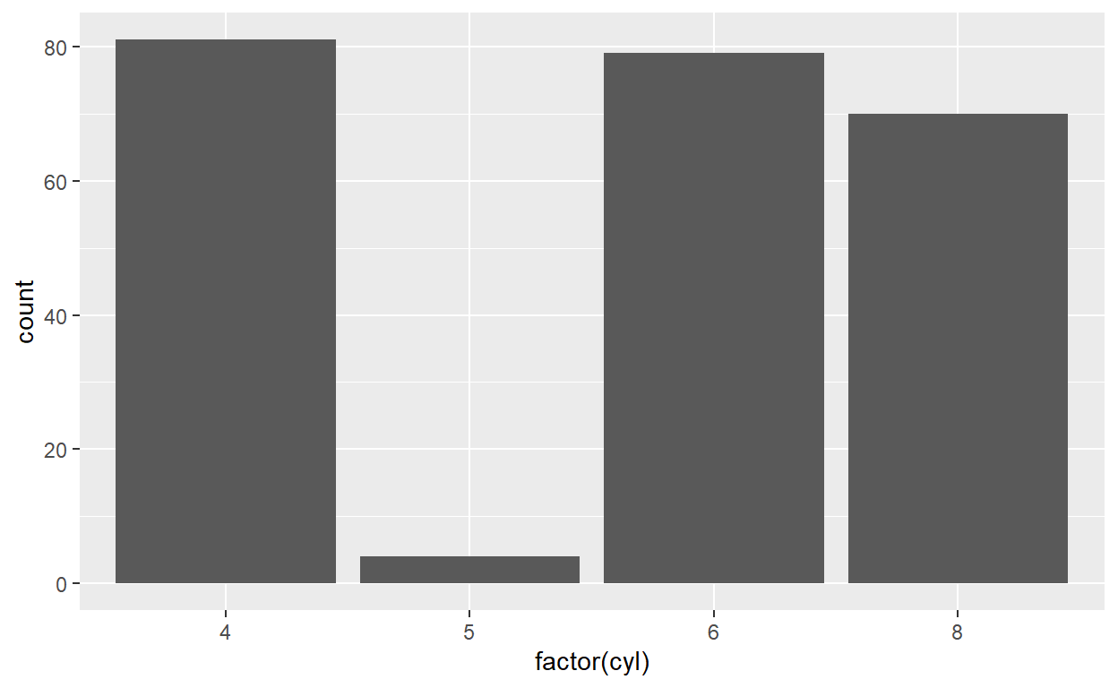
mpg  %>%
  group_by(year)  %>%
  e_charts(x= cyl, timeline = TRUE)  %>%
  e_timeline_opts(autoPlay = TRUE) %>%
  e_bar(cyl)  %>%
  e_timeline_serie(
    title = list(
      list(text = "1999", subtext = "Number of cars by number of cylinders"),
      list(text = "2008", subtext = "Number of cars by number of cylinders")
    )
    ) %>%
  e_legend(show = FALSE)
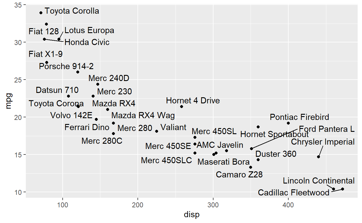
Text is a huge part of storytelling with your visualisation. Historically, textual annotations has not been the best part of ggplot2 but new extensions make up for that.
Standard geom_text will often result in overlaping labels
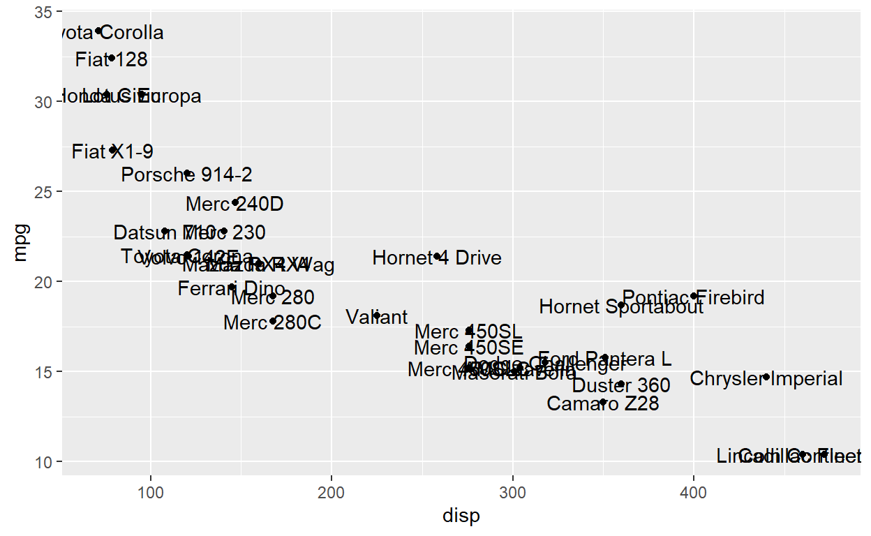
ggrepel takes care of that
ggplot(mtcars, aes(x = disp, y = mpg)) +
  geom_point() +
  geom_text_repel(aes(label = row.names(mtcars)))
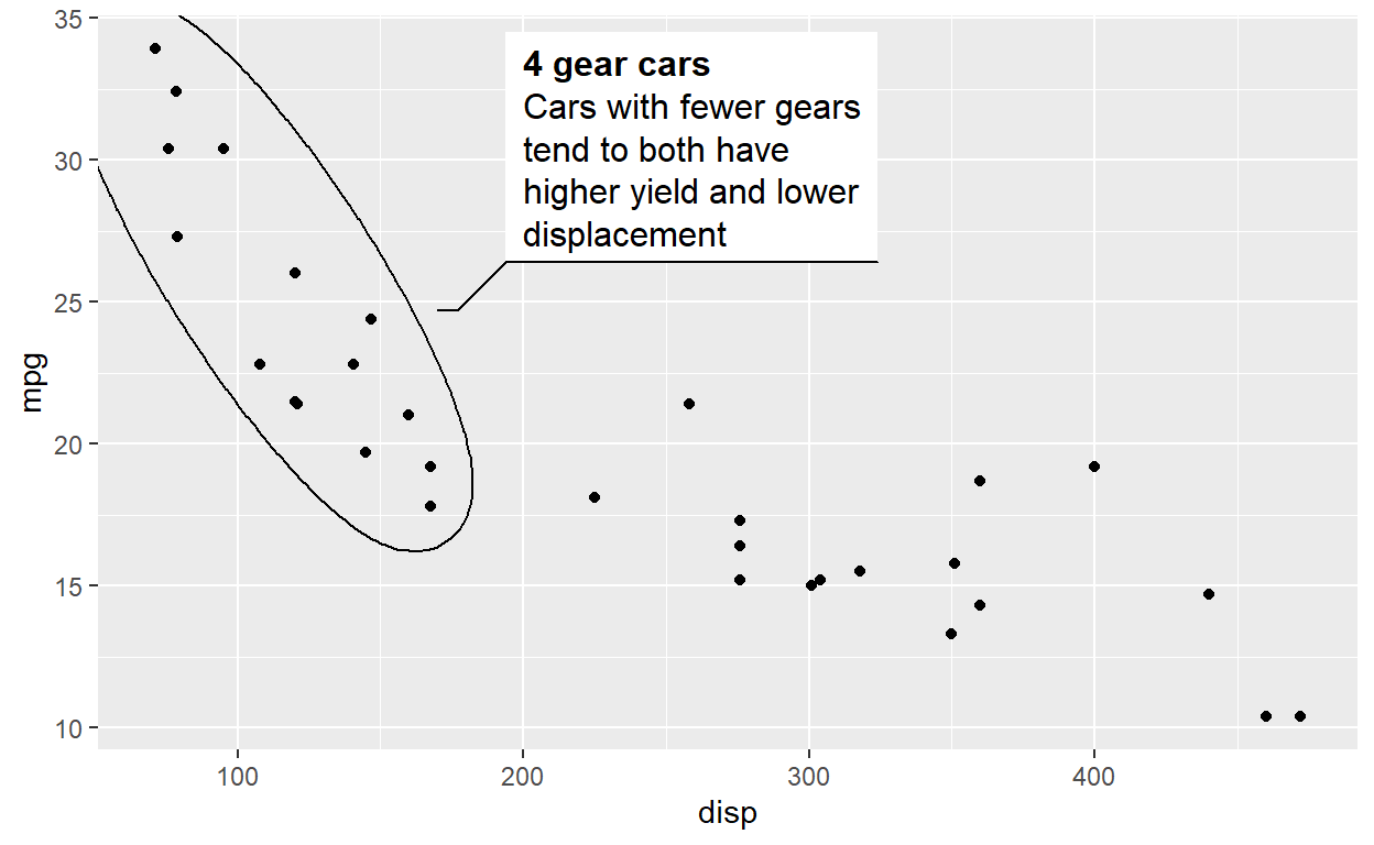
If you want to highlight certain parts of your data and describe it, the geom_mark_*() family of geoms have your back
ggplot(mtcars, aes(x = disp, y = mpg)) +
  geom_point() +
  geom_mark_ellipse(aes(filter = gear == 4,
                        label = '4 gear cars',
                        description = 'Cars with fewer gears tend to both have higher yield and lower displacement'))
Exercises - annotation
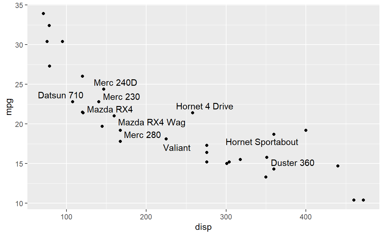
ggrepel has a tonne of settings for controlling how text labels move. Often, though, the most effective is simply to not label everything. There are two strategies for that: Either only use a subset of the data for the repel layer, or setting the label to "" for those you don’t want to plot. Try both in the plot below where you only label 10 random points.
Explore the documentation for geom_text_repel. Find a way to ensure that the labels in the plot below only repels in the vertical direction
mtcars2$label <- ""
mtcars2$label[1:10] <- rownames(mtcars2)[1:10]
ggplot(mtcars2, aes(x = disp, y = mpg)) +
  geom_point() +
  geom_text_repel(aes(label = label))
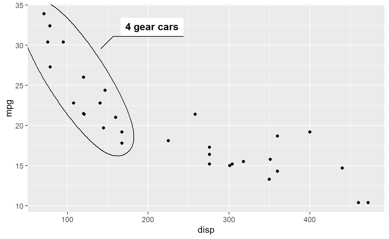
ggforce comes with 4 different types of mark geoms. Try them all out in the code below:
ggplot(mtcars, aes(x = disp, y = mpg)) +
  geom_point() +
  geom_mark_ellipse(aes(filter = gear == 4,
                        label = '4 gear cars'))
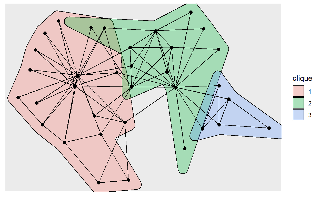
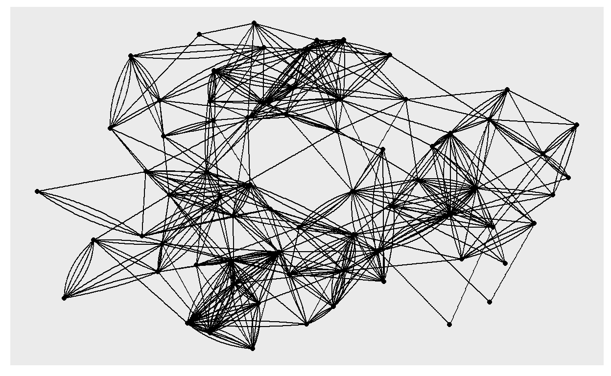
Networks
ggplot2 has been focused on tabular data. Network data in any shape and form is handled by ggraph
graph <- create_notable('zachary') %>%
  mutate(clique = as.factor(group_infomap()))

ggraph(graph) +
  geom_mark_hull(aes(x, y, fill = clique)) +
  geom_edge_link() +
  geom_node_point(size = 2)
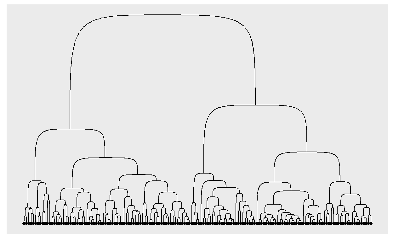
dendrograms are just a specific type of network
iris_clust <- hclust(dist(iris[, 1:4]))
ggraph(iris_clust) +
  geom_edge_bend() +
  geom_node_point(aes(filter = leaf))
Exercies- networks
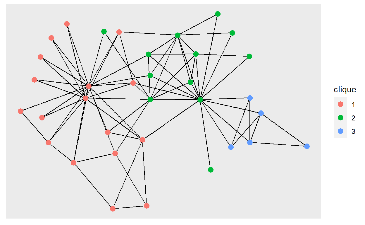
Most network plots are defined by a layout algorithm, which takes the network structure and calculate a position for each node. The layout algorithm is global and set in the ggraph(). The default auto layout will inspect the network object and try to choose a sensible layout for it (e.g. dendrogram for a hierarchical clustering as above). There is, however no optimal layout and it is often a good idea to try out different layouts. Try out different layouts in the graph below. See the the website for an overview of the different layouts.
ggraph(graph) +
  geom_edge_link() +
  geom_node_point(aes(colour = clique), size = 3)
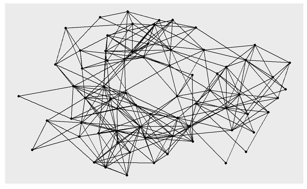
There are many different ways to draw edges. Try to use geom_edge_parallel() in the graph below to show the presence of multiple edges
highschool_gr <- as_tbl_graph(highschool)
ggraph(highschool_gr) +
  geom_edge_link() +
  geom_node_point()
Faceting works in ggraph as it does in ggplot2, but you must choose to facet by either nodes or edges. Modify the graph below to facet the edges by the year variable (using facet_edges())
ggraph(highschool_gr) +
  geom_edge_fan() +
  geom_node_point()
Looks
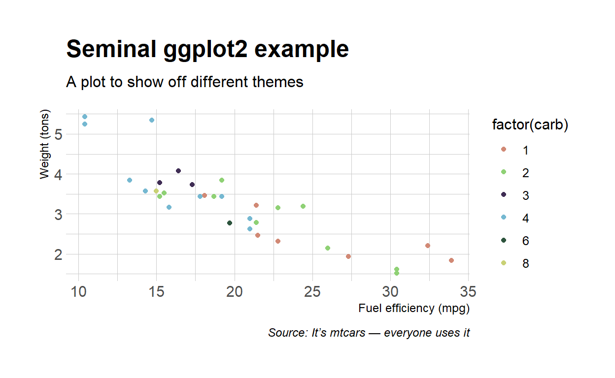
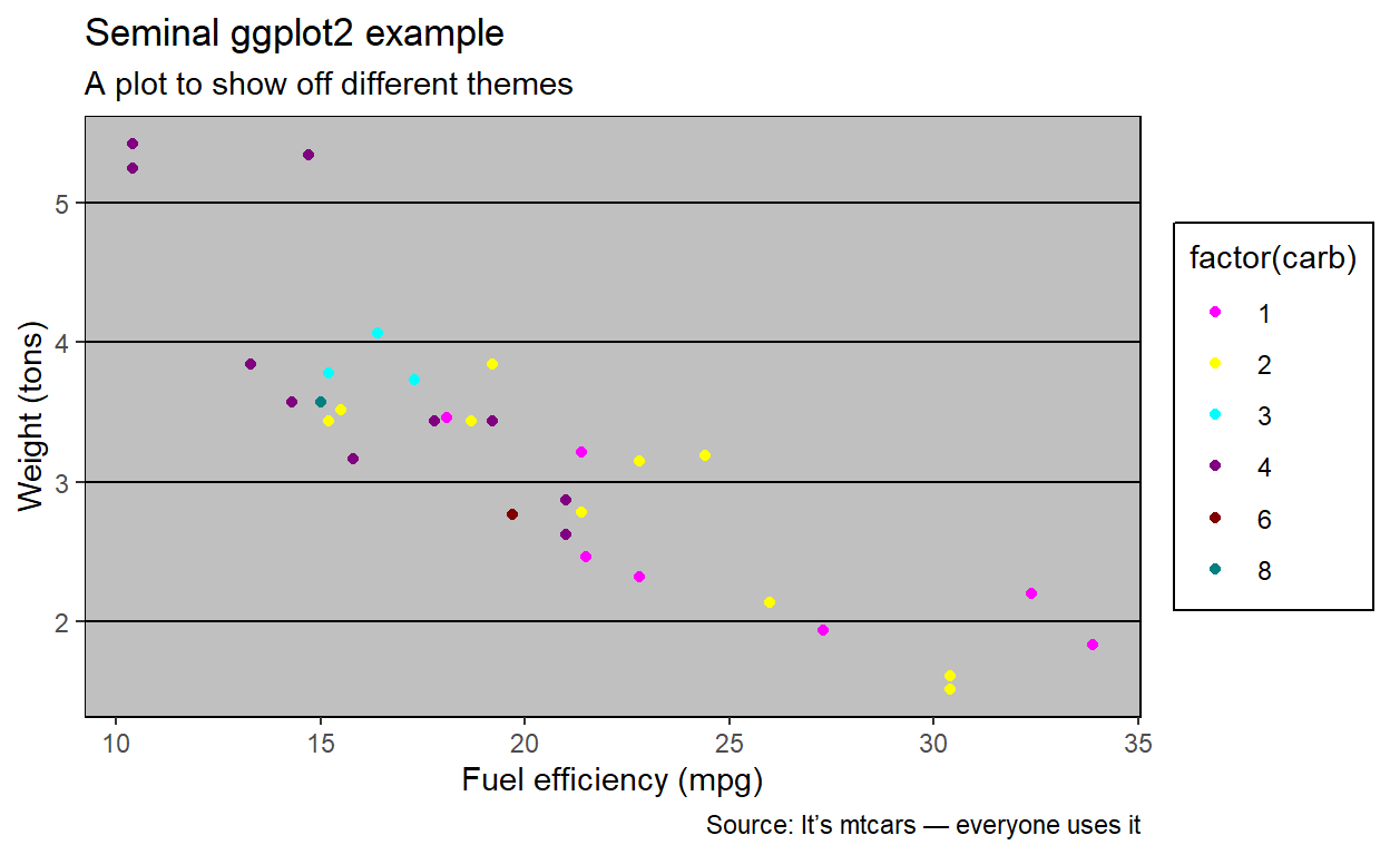
Many people have already designed beautiful (and horrible) themes for you. Use them as a base
p <- ggplot(mtcars, aes(mpg, wt)) +
  geom_point(aes(color = factor(carb))) +
  labs(
    x = 'Fuel efficiency (mpg)',
    y = 'Weight (tons)',
    title = 'Seminal ggplot2 example',
    subtitle = 'A plot to show off different themes',
    caption = 'Source: It’s mtcars — everyone uses it'
  )

p +
  scale_colour_ipsum() +
  theme_ipsum()
p +
  scale_colour_excel() +
  theme_excel()
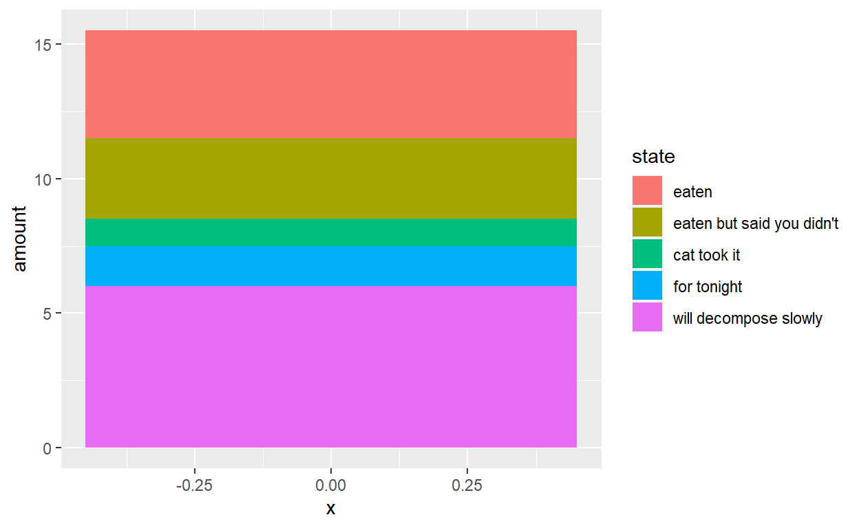
Drawing anything
states <- c(
  'eaten', "eaten but said you didn\'t", 'cat took it', 'for tonight',
  'will decompose slowly'
)
pie <- data.frame(
  state = factor(states, levels = states),
  amount = c(4, 3, 1, 1.5, 6),
  stringsAsFactors = FALSE
)
ggplot(pie) +
  geom_col(aes(x = 0, y = amount, fill = state))
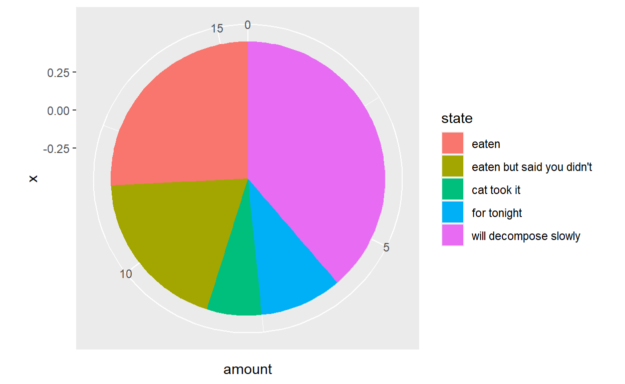
ggplot(pie) +
  geom_col(aes(x = 0, y = amount, fill = state)) +
  coord_polar(theta = 'y')
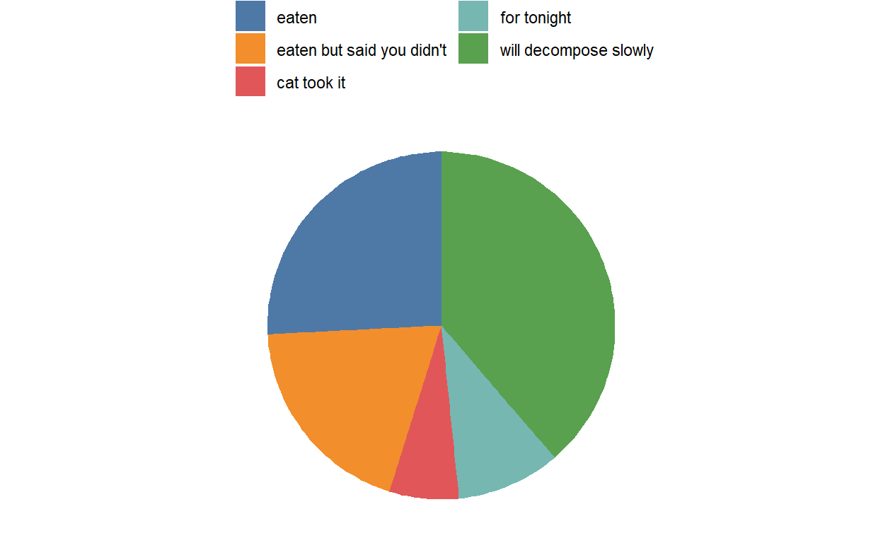
ggplot(pie) +
  geom_col(aes(x = 0, y = amount, fill = state)) +
  coord_polar(theta = 'y') +
  scale_fill_tableau(name = NULL,
                     guide = guide_legend(ncol = 2)) +
  theme_void() +
  theme(legend.position = 'top',
        legend.justification = 'left')
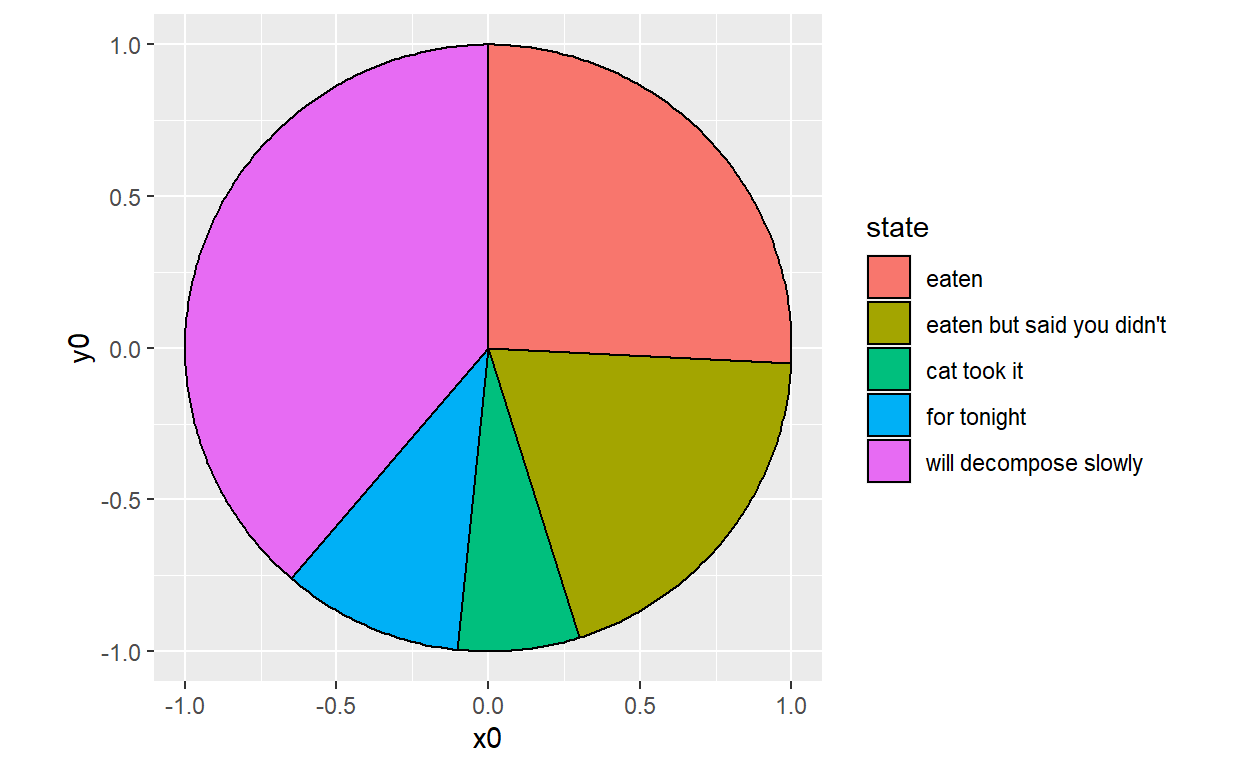
ggplot(pie) +
  geom_arc_bar(aes(x0 = 0, y0 = 0, r0 = 0, r = 1, amount = amount, fill = state), stat = 'pie') +
  coord_fixed()
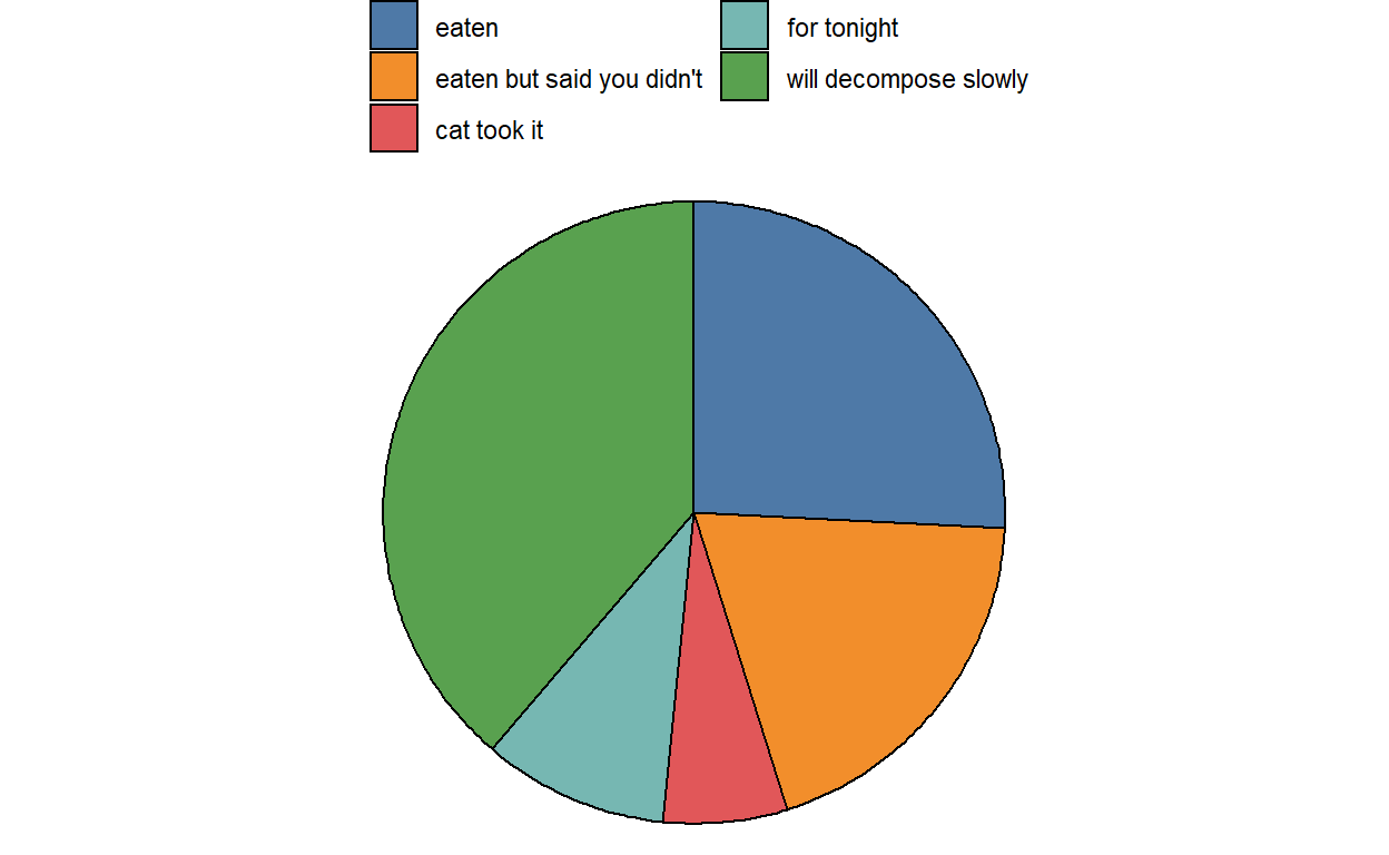
ggplot(pie) +
  geom_arc_bar(aes(x0 = 0, y0 = 0, r0 = 0, r = 1, amount = amount, fill = state), stat = 'pie') +
  coord_fixed() +
  scale_fill_tableau(name = NULL,
                     guide = guide_legend(ncol = 2)) +
  theme_void() +
  theme(legend.position = 'top',
        legend.justification = 'left')
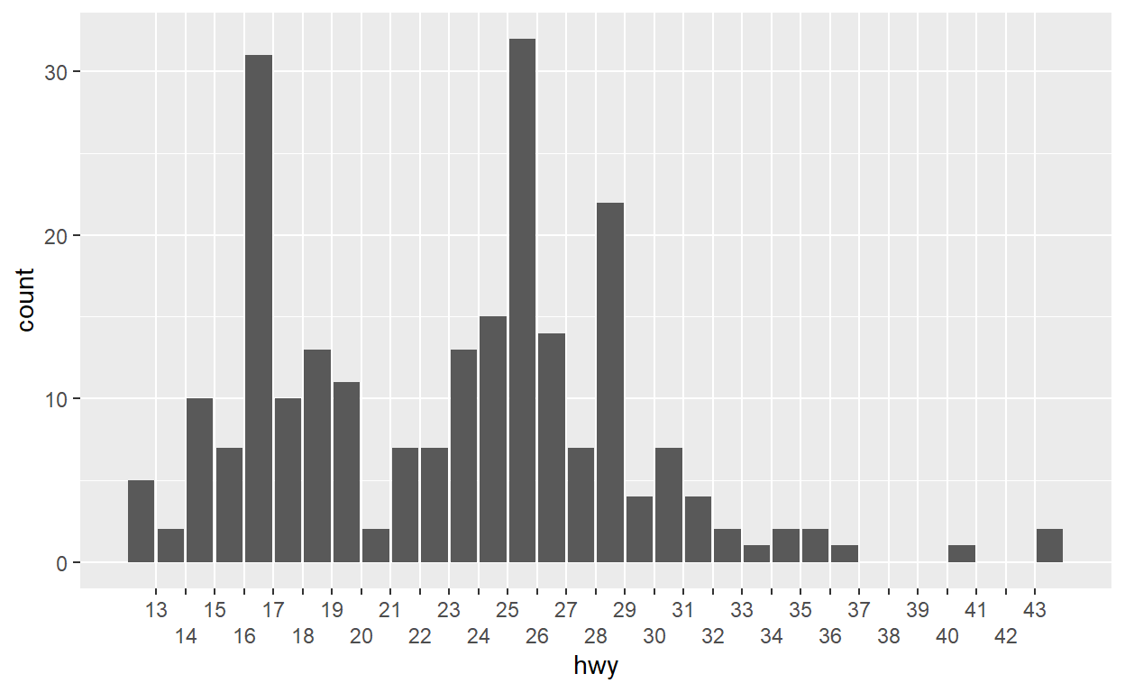
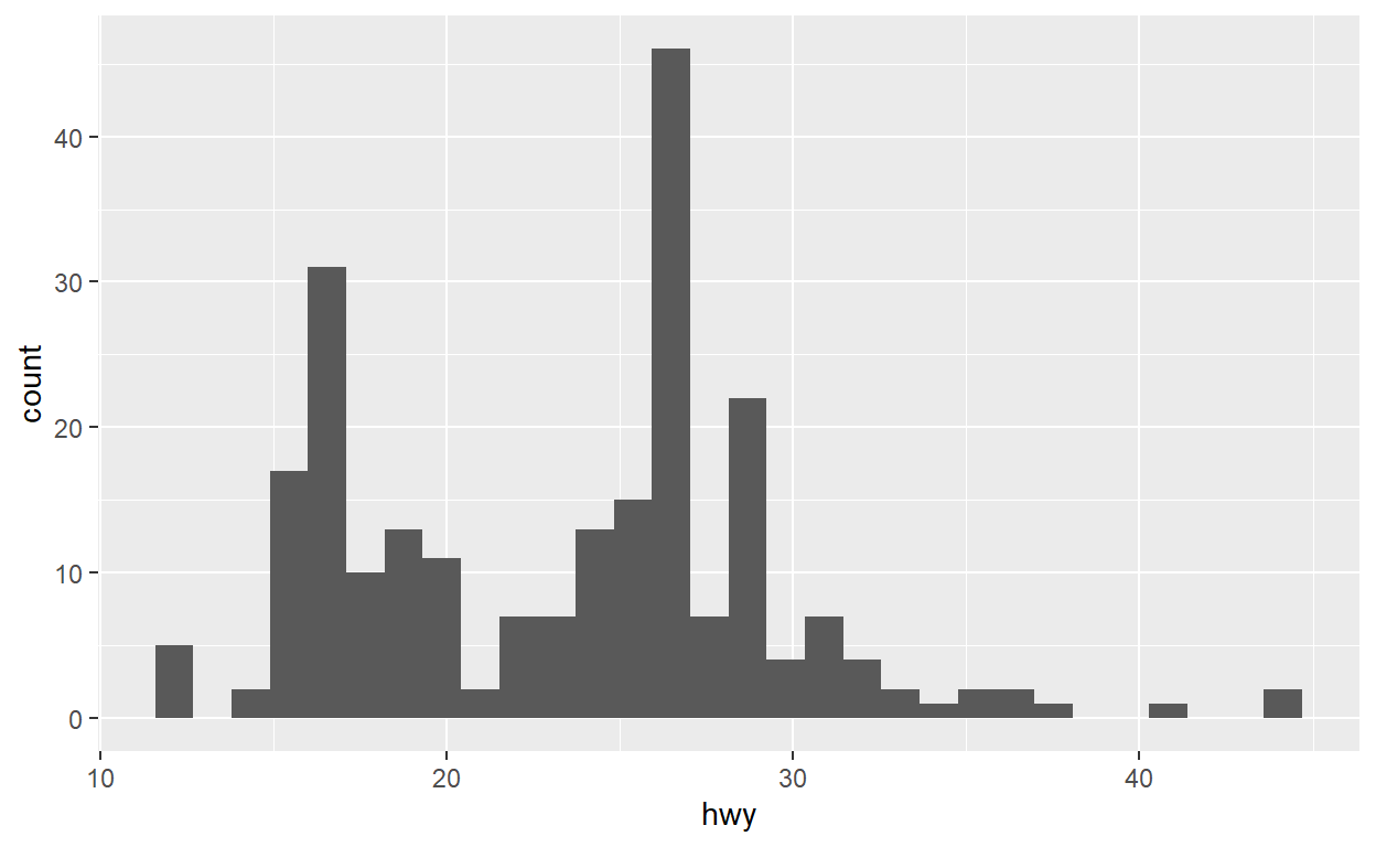
ggplot(mpg) +
  # geom_bar(aes(x = hwy), stat = 'bin')
  geom_histogram(aes(x = hwy))
ggplot(mpg) +
  geom_bar(aes(x = hwy)) +
  scale_x_binned(n.breaks = 30, guide = guide_axis(n.dodge = 2))